piątek, 22 listopada 2019

Justyna Leja - Z szuflady niemych myśli


Zaglądam do środka, klarowne strony, elegancja i zrozumiałość. Nawet wstęp i zakończenie (czyli odpowiednio "Drogi czytelniku!" oraz "podziękowania") przybrały formę wierszy ze zwrotkami, to nawet ciekawe z formalnego punktu widzenia.

Ale zacznijmy od tego, skąd mam ten tomik (w dodatku z dedykacją!). Wygrałem go na instagramowym konkursie, zorganizowanym przez Autorkę. Od dawna czytam teksty tej Poetki, są one dopracowane, obcowanie z taką lekturą jest przyjemne.

Co ogólnie można powiedzieć o tych wierszach? Nie jest to dążenie do przewrotu, nie ma tu ataków na coś czy zmagań z formą. Mamy tu do czynienia z cieszeniem się spokojem. Wiersze są dobrze zredagowane, dobór słów nie jest przypadkowy, tylko przemyślany.

Weźmy jakiś przykładowy wiersz:

NIE MARTW SIĘ

Tak trudno jest kogoś podnieść,
jeszcze trudniej samemu wstać,
już nie martw się o mnie,
zrzućmy ten plecak
smutnych wspomnień
i chodźmy nad staw.

Na mnie to zadziałało, tak jak działają wiersze haiku. Czuję podobny klimat, jest wskazana jakaś sytuacja, jakaś mgiełka zmartwienia, które jednak nie może nas przytłoczyć. Jeśli miałbym szukać skojarzenia z twórczością jakiejś osoby, to mi do głowy przychodzi Horacy. Podobny spokój, niekiedy filozoficzne podejście do prostych spraw.

Jest to poezja notująca uczucia. Mamy tu do czynienia nie tylko z ekspresją, ale też ze zrozumiałą komunikacją. Myślę, że na spotkaniach autorskich odbiorcy z przyjemnością słuchają tych wierszy.

Justyna Leja, Z szuflady niemych myśli, Ridero 2019, ss. 51.
https://www.instagram.com/justyna_pisze_wiersze

niedziela, 10 listopada 2019

Petra Schulze-Wollgast


- Your "copy transform" chapbook from the "Visual Shareware" series is my favourite. Can you tell us something about the brochure, about the blue version, and about the whole series?

For copy transform I took some of my typographic work and put it on a small table photocopier machine. I was quite impressed how the impact changed in comparison to the original works.

When doing the photocopies I wished I could also print in Blue with the photocopier, but I didn’t could get blue toner for my machine. Later when I got in touch with mimeo printing I could realize it with a second edition, "copy transform - blue version".

Recently I found an old spirit duplicator and I printed a third edition with it, "copy transform - spirit version".

Funny thing it was not my plan to make this editions when I created the photocopier version. This is in fact quite typical for my working, things happen and my work is developing unforeseen.


- I would like to ask you about the meta level - sometimes you type about typing, and for example the title "Is there a Plan behind the Plan" also sounds interesting in the meta level context. Do you take notes on what projects you are planning?

Actually, I don't really plan my work, I sometimes make a short note of ideas - but just not to forget them again.

The meta-level usually comes later - for example when I'm looking for a title. I always hang my works on the pinboard after their creation and communicate with them, so to speak.

I find it interesting myself what associations, cross connections and meta levels arise.


- It's interesting to read the explanations of the technique used on your publications (for example "dry transfer lettering on white lines"). Are these just notes, or should they influence the reader?

For me, the used technique is an essential part of the creation of my work. I’m experimenting with outdated printing and duplication techniques — and that is sometimes reflected in the title.

I think it does something to the viewer, at least it's an explanation.


- What do you think about tradition, regarding old writing and printing machines and techniques?

I’m just fascinated by these old print making techniques and machines.

Doing by hand, slowly. ;)

- Is using the backside of the font more encryption or censorship?

Interesting question, could definitely be both. I don’t want to decide that - at the end it is unreadable!

It’s just an example for finding a meta level: But this is another nice example of the meta-level that can arise.

Actually, I print the backs of the letters first of all because of their geometric shape, and the constructions that can be created from them. But these backs also often have a beautiful structure.

When I printed the backs of the metal type letters, for example, I noticed that the perforated structure of the feet often looks like galaxies. This resulted in the title of the series, "The Backside of the Universe".


- You exhibit your works in many places. How do you find places to exhibit?

For me, the exchange with like-minded artists is important — and extremely inspiring. And I found my concrete poetry community mainly through the social networks. There is it, where I exhibit my work :)

Sometimes I am also invited to exhibitions in the real world then.

- Can you tell us something about ToCall?

Last year I found an antiquarian copy of the last edition of Tlaloc published by Cavan McCarthy in the 1970s. At that time there were many such anthological, periodical, independent magazines in which poets and artists could publish their works.

I was extremely fascinated by the idea and simplicity - and it was printed on the mimeograph.

I was just so excited that I decided to print a magazine about visual and concrete poetry on my mimeograph.


- You sometimes concentrate on the shape of poems. Are you searching for new forms, or do you want the reader to notice the form?

Since I’m interested not only in letters but also in geometrics, indeed, I want the reader to notice the form of texts and poems.

- I'm interested in the sphere where poetry and comics overlap - it's mostly visible between experimental comics and visual poetry (I call it neopoemics). Do you like it when arts meet?

For sure, I like the discovery of new spheres.

With printing typographics I found my way in the field between art and literature - and that’s great!

- Which do you prefer: the square, or the A4 format? And why?

I prefer the technically more suitable. For the typewriter I often choose the square because I can then turn the page.

For my mimeograph, the A4 format is the most effective, then I don't have to cut anything. And the A4 paper is often cheaper.

https://pswgallery.tumblr.com/tagged/backside-of-the-universe
www.psw.gallery

sobota, 9 listopada 2019

Petra Schulze-Wollgast

- Moja ulubiona broszurka Twojego autorstwa to „copy transform” z serii „Visual Shareware”. Czy możesz powiedzieć coś o tej broszurze, o jej wersji niebieskiej i o całej serii?
W serii „copy transform” umieściłam starsze prace typograficzne na starej kserokopiarce stołowej i byłam zaskoczona, jak ciekawe efekty uzyskałam w porównaniu do oryginałów. Chciałam drukować niebieskim tonerem, ale nie był dostępny dla tej kserokopiarki. Gdy rok później dostałam mimeograf, mogłam zrealizować niebieską wersję, czyli „copy transform - blue version”.
A kiedy niedawno znalazłem stary powielacz spirytusowy, wpadłam na pomysł, aby wydrukować tę serię w trzeciej technice, „copy transform - spirit version”.
Cała sprawa nie była planowana od samego początku. Projekt ewoluował wraz z każdym nowym (starym) znalezionym duplikatorem. Kto wie, może będzie jeszcze kontynuacja tego projektu - to całkiem możliwe.


- Chciałbym cię zapytać o poziom meta - czasami piszesz o pisaniu, a na przykład tytuł „Is there a plan behind the plan?” również brzmi interesująco w kontekście poziomu meta. Czy notujesz, jakie projekty planujesz?
Właściwie tak naprawdę nie planuję swojej pracy, czasami zapisuję pomysły - ale tylko po to, żeby ich nie zapomnieć. Poziom meta zwykle rozwija się później - na przykład, gdy szukam tytułu. Zawsze po stworzeniu pracy, zawierszam ją na tablicy korkowej i się z nią komunikuję, że tak powiem. Uważam, że powstające skojarzenia, powiązania i meta-poziomy są interesujące.


- Ciekawe są objaśnienia technik stosowanych w twoich publikacjach (na przykład „literowanie suchym transferem na białych liniach”). Czy to tylko notatki, czy powinny mieć wpływ na czytelnika?
Dla mnie zastosowana technika jest istotną częścią tworzenia mojej pracy. Eksperymentuję z przestarzałymi technikami drukowania i powielania, co czasami znajduje odzwierciedlenie w tytule. Myślę, że oddziałuje to na widza, albo przynajmniej jest jakimś wyjaśnieniem.

- Co sądzisz o tradycji, dotyczącej starych maszyn i technik pisania i drukowania?
Stare techniki drukowania mnie fascynują. Ręczna, powolna robota, ze zrozumieniem. ;)
- Czy używanie tylnej strony czcionki jest bardziej szyfrowaniem, czy cenzurą?
To interesujące pytanie - może być jednym i drugim. Nie chcę o tym decydować, ostatecznie jest to nieczytelne. Ale znowu jest to dobry przykład poziomu meta, który może powstać: w rzeczywistości drukuję najpierw litery z powodu ich geometrycznego kształtu i konstrukcji, które można z nich zbudować. Tylna strona czcionki często ma piękną strukturę.
Kiedy odbijałam tylną stronę czcionek, zauważyłam, że dziurawa struktura odbitek przypomina galaktyki. Z tego wyłonił się tytuł serii „Tylna strona wszechświata”.


- Wystawiasz swoje prace w wielu miejscach. Jak znajdujesz miejsca, w których masz wystawy?
Dla mnie wymiana z osobami o podobnych poglądach jest ważna i niezwykle inspirująca. I znalazłam swoje środowisko poezji konkretnej głównie za pośrednictwem mediów społecznościowych. Tam też pokazuję swoje prace :). Czasami też jestem zapraszana na wystawy w realnym świecie.
- Czy możesz nam coś powiedzieć o ToCall?
W zeszłym roku znalazłam antykwaryczną kopię ostatniego numeru Tlaloc, opublikowaną przez Cavana McCarthy'ego w latach siedemdziesiątych. W tamtym czasie istniało wiele takich antologicznych, periodycznych zinów, w których poeci i artyści mogli publikować swoje prace. Byłam bardzo zafascynowana pomysłem i prostotą - a Tlatloc został wydrukowany na mimeografie. Byłam tak zachwycona, że postanowiłam wydrukować właśnie taki zin o poezji wizualnej i konkretnej na własnym mimeografie.


- Czasami koncentrujesz się na kształcie wierszy. Szukasz nowych form, czy raczej chcesz, żeby czytelnik zwrócił uwagę na formę?
Tak, interesują mnie zarówno geometryczne kształty, jak i litery oraz to, co można z nimi zrobić. Rzeczywiście chcę, żeby czytelnik dostrzegał formę tekstów i wierszy.
- Interesuje mnie sfera, w której poezja i komiks nakładają się - jest to głównie widoczne pomiędzy komiksem eksperymentalnym a poezją wizualną (nazywam to neopoemiksem). Czy podoba ci się, gdy sztuki się spotykają?
Z pewnością! Drukując elementy typograficzne znalazłam się na pograniczu sztuki i literatury, to jest totalnie ekscytujące!
- Co wolisz: kwadrat, czy format A4? I dlaczego?
Wolę to, co jest bardziej odpowiednie pod względem technicznym. W przypadku maszyny do pisania często wybieram kwadrat, ponieważ mogę następnie obrócić arkusz o 90 stopni. W przypadku mimeografu format A4 jest najefektywniejszy, nie muszę niczego ciąć - i papier w formacie A4 jest często tańszy.

https://pswgallery.tumblr.com/tagged/backside-of-the-universe
www.psw.gallery

Petra Schulze-Wollgast

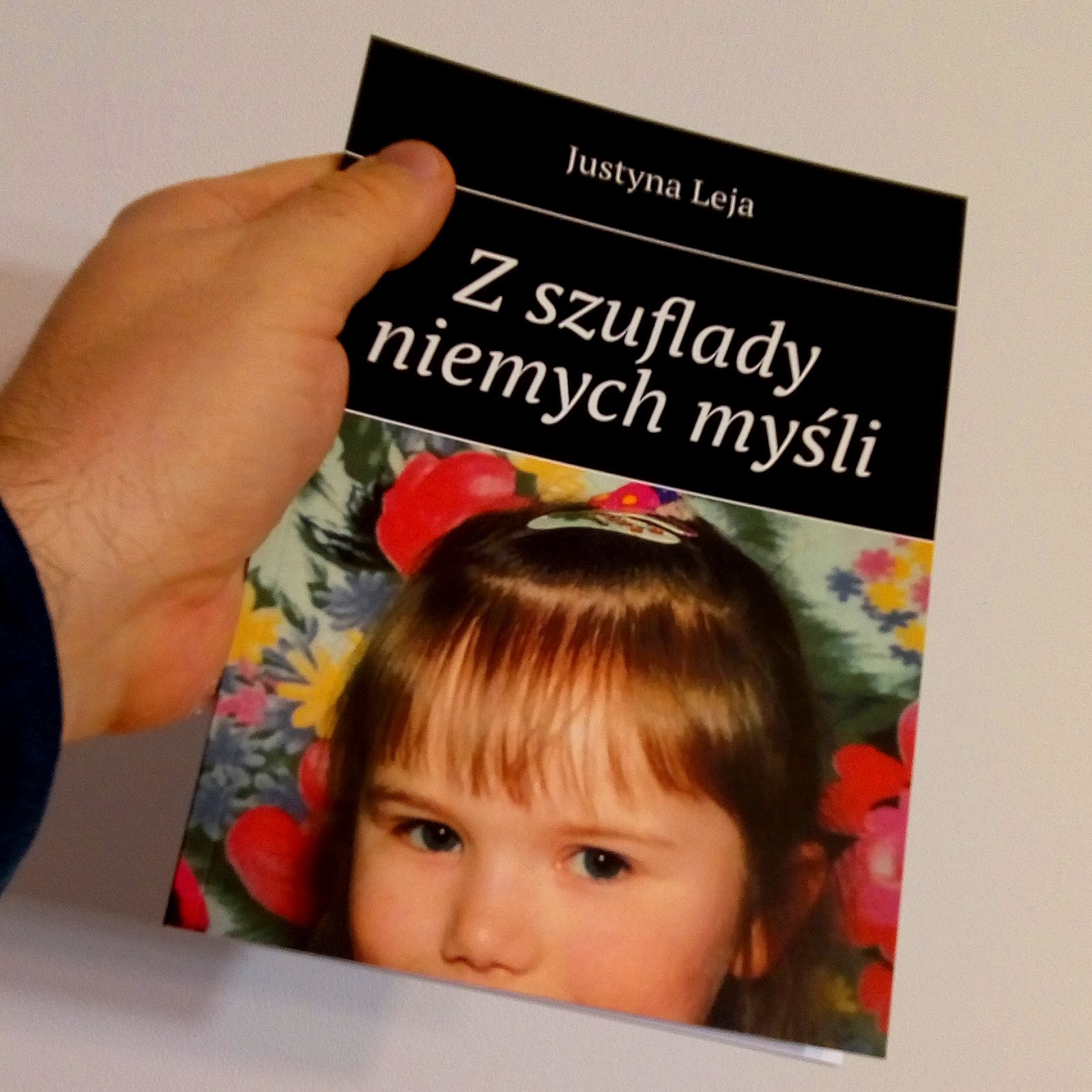
- Dein "copy transform" chapbook aus der "Visual Shareware" Serie ist mein Favorit. Kannst du uns etwas über die Broschüre, über die blaue Version und über die ganze Serie erzählen?
Für die Serie „copy transform“ habe ich einige ältere typografische Arbeiten auf einen alten Tisch-Fotokopierer gelegt, und war überrascht, welche interessanten Effekte das im Vergleich zu den Originalen hatte. Am liebsten hätte ich ja mit blauem Toner gedruckt, aber der war für diesen Fotokopierer nicht erhältlich. Als ich ein Jahr später dann meinen Mimeographen bekam, konnte ich das dann die Blaue Version realisieren, „copy transform – blue version“.
Und als ich kürzlich einen alten Spiritduplikator fand, kam ich auf die Idee, diese Serie auch noch in einer dritten Technik zu drucken, „copy transform - spirit serial“.
Das Ganze war also nicht von vornherein so geplant. Es hat sich so entwickelt, mit jedem neuen (alten) Vervielfältiger, den ich fand. Wer weiß vielleicht gibt es noch eine Fortsetzung - gut möglich.


- Ich möchte dich nach der Metaebene fragen - manchmal tippst du etwas über das Tippen, zum Beispiel klingt der Titel "Is there a Plan behind the Plan?" auch im Kontext der Metaebene interessant. Machst du dir Notizen zu den Projekten, die du planst?
Eigentlich plane ich meine Arbeiten nicht wirklich, ich notiere mir zwar manchmal kurz Ideen - aber nur damit ich es nicht wieder vergesse.
Das Meta-Level entwickelt sich meist erst später - beispielsweise wenn ich einen Titel suche. Ich hänge meine Arbeiten nach ihrer Entstehung immer an die Pinnwand und kommuniziere sozusagen damit.
Ich finde das selbst interessant welche Assoziationen, Querverbindungen und Meta-Level sich ergeben.


- Es ist interessant, die Erläuterungen zu den in deinen Publikationen verwendeten Techniken zu lesen (z. B. "dry transfer letterings on white lines"). Handelt es sich nur um Notizen, oder sollten sie den Leser beeinflussen?
Für mich ist die verwendete Technik essentieller Teil der Entstehung meiner Arbeiten. Ich experimentiere mit veralteten Druck- und Vervielfältigungstechiken und das spiegelt sich eben manchmal auch im Titel wider.
Ich denke schon, dass das auch etwas mit dem Betrachter macht, zumindest ist es ja eine Erklärung.


- Was hältst du von Tradition in Bezug auf alte Schreib- und Druckmaschinen und alte Drucktechniken?
Ich bin fasziniert von diesen alten Drucktechniken. Mit den Händen arbeiten, es langsam tun, verstehen, was man tut. ;)
- Ist das Drucken der Rückseiten der Lettern eher Verschlüsselung oder Zensur?
Das ist eine interessante Frage, könnte tatsächlich beides sein. Ich möchte das gar nicht entscheiden, letztlich ist es unlesbar.
Aber das ist wieder ein schönes Beispiel für die Metaebene, die sich ergeben kann:  Eigentlich drucke ich die Rückseiten der Lettern erstmal aufgrund ihrer geometrischen Form, und der Konstruktionen, die sich daraus bauen lassen. Diese Rückseiten haben auch selbst oft eine wunderschöne Struktur.
Beim Drucken der Rückseiten der Bleilettern stellte ich beispielsweise fest, dass die löchrige Struktur der Füße der Bleilettern an Galaxien erinnert. Daraus hat sich dann der Titel der Serie ergeben, „Die Rückseite des Universums“.


- Du stellst deine Arbeiten an vielen Orten aus. Wie findest du Orte, an denen du ausstellen kannst?
Für mich ist der Austausch mit Gleichgesinnten wichtig — und extrem inspirierend. Und ich habe meine Community vor allem über die sozialen Netzwerke gefunden. Dort stelle ich meine Arbeiten aus :)
Manchmal werde ich dann auch zu Ausstellungen in de physischen Welt eingeladen.
- Kannst du uns etwas über ToCall erzählen?
Letztes Jahr fand ich in ein antiquarisches Exemplar der letzten Ausgabe von Tlaloc, das von Cavan McCarthy in den 70er Jahren publiziert wurde. Damals gab es viele solcher anthologischen, periodisch erscheinenden Magazine, in denen Poeten und Künstler ihre Arbeiten publizieren konnten.
Ich war extrem fasziniert von der Idee und Einfachheit - und es war auf dem Mimeographen gedruckt.
Ich war einfach so begeistert davon, dass ich beschloss, genau so ein Magazin über visuelle und konkrete Poesie auch zu drucken, auf meinem eigenen Mimeographen.


- Du konzentrierst dich manchmal auf die äußere Form von Gedichten. Suchst du nach neuen Formen oder möchtest du den Leser auf die Form aufmerksam machen?
Ja, ich bin an beidem interessiert, an geometrischen Formen und Lettern, und dem was man daraus machen kann.
- Ich interessiere mich für die Sphäre, in der sich Poesie und Comics überschneiden - es ist meistens sichtbar zwischen experimentellen Comics und visueller Poesie (ich nenne es Neopoemics). Magst du es, wenn sich die Künste treffen?
Auf jeden Fall! Durch das Drucken typografischer Elemente bin ich ja selbst im Grenzbereich von Kunst und Literatur gelandet, es ist total spannend!
- Was bevorzugst du, das quadratische oder das A4-Format? Und warum?
Ich bevorzuge das, was technisch besser eignet. Für die Schreibmaschine wähle ich oft das Quadrat, weil ich das Blatt dann um 90grad drehen kann.
Für den Mimeographen ist das A4 Format am effektivsten, dann muss ich nichts abschneiden - und auf A4 geschnittenes Papier ist oft preiswerter.

https://pswgallery.tumblr.com/tagged/backside-of-the-universe
www.psw.gallery